
 Accueil
 Créer un forum
Adaption raté d'un code, help svp !
2 participants
Forum gratuit : Le forum des forums actifs :: Entraide & Support... :: Problème avec un script, un code :: Archives des problèmes avec un code
Page 1 sur 1 • Partagez


 Adaption raté d'un code, help svp !
 par Carey Ven 8 Fév 2013 - 1:51
Bonjour
J'ai essayé de reproduire ceci : http://www.css3create.com/Rotation-d-un-menu-en-CSS3
mais pour l'instant j'obtiens ça : http://eternara-academy.forumactif.com/h1-pv
Mon but est de mettre deux menu rotatif cote à cote sous l'image.
et je ne sais pas non plus comment changer la couleur, écriture etc des menus...
Voilà mon code :
Merci d'avance à qui m'aidera =)
J'ai essayé de reproduire ceci : http://www.css3create.com/Rotation-d-un-menu-en-CSS3
mais pour l'instant j'obtiens ça : http://eternara-academy.forumactif.com/h1-pv
Mon but est de mettre deux menu rotatif cote à cote sous l'image.
et je ne sais pas non plus comment changer la couleur, écriture etc des menus...
Voilà mon code :
- Code:
<HTML><HEAD><TITLE>Affichage menu rotatif</TITLE>
<style>
/* CSS3 rotating menu */
body {
height: 360px;
font-family: "helvetica",sans-serif;
font-size: 1em;
margin: 0px;
padding: 0px;
}
#article16 {
position: relative;
width: 300px;
margin: 0 auto;
}
#article16 dl {
position: relative;
width: 120px;
top: 20px;
margin: 0 auto;
height: 155px;
color: #324040;
text-align: center;
background: #04b3d2;
/*linear-gradient*/
background: -webkit-gradient(linear,left top,left bottom,from(#04b3d2),to(#48dfff));
background: -webkit-linear-gradient(top,#04b3d2,#48dfff);
background: -moz-linear-gradient(top,#04b3d2,#48dfff);
background: -o-linear-gradient(top,#04b3d2,#48dfff);
background: linear-gradient(top,#04b3d2,#48dfff);
/*border-radius*/
-webkit-border-radius: 4px;
-moz-border-radius: 4px;
border-radius: 4px;
/*box-shadow*/
-webkit-box-shadow: 0px 0px 6px rgba(0,0,0,0.7);
-moz-box-shadow: 0px 0px 6px rgba(0,0,0,0.7);
box-shadow: 0px 0px 6px rgba(0,0,0,0.7);
/*transform-origin*/
-webkit-transform-origin: 50% 120px;
-moz-transform-origin: 50% 120px;
-ms-transform-origin: 50% 120px;
-o-transform-origin: 50% 120px;
transform-origin: 50% 120px;
/*transition*/
-webkit-transition: -webkit-transform 0.7s ease-in-out;
-moz-transition: -moz-transform 0.7s ease-in-out;
-o-transition: -o-transform 0.7s ease-in-out;
transition: transform 0.7s ease-in-out;
/*webkit plus*/
/*animation*/
-webkit-animation: bounceOut 0.7s ease-in-out;
-moz-animation: bounceOut 0.7s ease-in-out;
-ms-animation: bounceOut 0.7s ease-in-out;
-o-animation: bounceOut 0.7s ease-in-out;
animation: bounceOut 0.7s ease-in-out;
}
#article16 dt {
position: absolute;
bottom: 0px;
width: 100%;
height: 30px;
}
#article16 dd {
/*transform*/
-webkit-transform: rotate(180deg);
-moz-transform: rotate(180deg);
-ms-transform: rotate(180deg);
-o-transform: rotate(180deg);
transform: rotate(180deg);
}
#article16 dd a {
display: block;
height: 24px;
padding: 3px 20px;
color: #324040;
text-decoration: none;
}
#article16 dd a:hover { background: rgba(255,255,255,0.1) }
#article16 dl:hover {
/*transform*/
-webkit-transform: rotate(-180deg);
-moz-transform: rotate(-180deg);
-ms-transform: rotate(-180deg);
-o-transform: rotate(-180deg);
transform: rotate(-180deg);
/*transition*/
-webkit-transition: -webkit-transform 0.5s ease-in-out;
-moz-transition: -moz-transform 0.5s ease-in-out;
-o-transition: -o-transform 0.5s ease-in-out;
transition: transform 0.5s ease-in-out;
/*webkit plus*/
/*animation*/
-webkit-animation: bounceIn 0.7s ease-in-out;
-moz-animation: bounceIn 0.7s ease-in-out;
-ms-animation: bounceIn 0.7s ease-in-out;
-o-animation: bounceIn 0.7s ease-in-out;
animation: bounceIn 0.7s ease-in-out;
}
@-webkit-keyframes bounceIn {
from { -webkit-transform: rotate(0deg) }
75% { -webkit-transform: rotate(-200deg) }
90% { -webkit-transform: rotate(-175deg) }
to { -webkit-transform: rotate(-180deg) }
}
@-moz-keyframes bounceIn {
from { -webkit-transform: rotate(0deg) }
75% { -webkit-transform: rotate(-200deg) }
90% { -webkit-transform: rotate(-175deg) }
to { -webkit-transform: rotate(-180deg) }
}
@-o-keyframes bounceIn {
from { -webkit-transform: rotate(0deg) }
75% { -webkit-transform: rotate(-200deg) }
90% { -webkit-transform: rotate(-175deg) }
to { -webkit-transform: rotate(-180deg) }
}
@-ms-keyframes bounceIn {
from { -webkit-transform: rotate(0deg) }
75% { -webkit-transform: rotate(-200deg) }
90% { -webkit-transform: rotate(-175deg) }
to { -webkit-transform: rotate(-180deg) }
}
@-webkit-keyframes bounceOut {
from { -webkit-transform: rotate(-360deg) }
0% { -webkit-transform: rotate(-180deg) }
10% { -webkit-transform: rotate(-160deg) }
to { -webkit-transform: rotate(-360deg) }
}
@-moz-keyframes bounceOut {
from { -webkit-transform: rotate(-360deg) }
0% { -webkit-transform: rotate(-180deg) }
10% { -webkit-transform: rotate(-160deg) }
to { -webkit-transform: rotate(-360deg) }
}
@-o-keyframes bounceOut {
from { -webkit-transform: rotate(-360deg) }
0% { -webkit-transform: rotate(-180deg) }
10% { -webkit-transform: rotate(-160deg) }
to { -webkit-transform: rotate(-360deg) }
}
@-ms-keyframes bounceOut {
from { -webkit-transform: rotate(-360deg) }
0% { -webkit-transform: rotate(-180deg) }
10% { -webkit-transform: rotate(-160deg) }
to { -webkit-transform: rotate(-360deg) }
}
#article16 .masque {
position: absolute;
z-index: 50;
width: 100%;
height: 135px;
top: 0;
left: 0;
background: #627878;
/*linear-gradient*/
}
#article16 .ombre {
position: relative;
width: 300px;
height: 6px;
top: -22px;
margin-top: -103px;
left: 0px;
/*box-shadow*/
-webkit-box-shadow: 0px 100px 3px black;
-moz-box-shadow: 0px 100px 3px black;
box-shadow: 0px 100px 3px black;
/*border-radius*/
-webkit-border-radius: 75px 75px 75px 75px / 3px 3px 3px 3px;
-moz-border-radius: 75px 75px 75px 75px / 3px 3px 3px 3px;
border-radius: 75px 75px 75px 75px / 3px 3px 3px 3px;
}
</style>
</HEAD>
<BODY>
<section id="article16" >
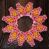
<img src="http://25.media.tumblr.com/tumblr_mb6k7cgOdI1rv5zh8o1_500.gif" class="imagepv">
<dl class="menu">
<dt class="btnRot">Partager</dt>
<dd><a href="">GOOGLE+</a></dd>
<dd><a href="">DELICIOUS</a></dd>
<dd><a href="">FACEBOOK</a></dd>
<dd><a href="">TWITTER</a></dd>
</dl>
<div class="masque"></div>
<div class="ombre"></div>
</section>
</BODY></HTML>
Merci d'avance à qui m'aidera =)
Dernière édition par Carey le Ven 8 Fév 2013 - 19:08, édité 1 fois

Carey- **
- Messages : 64
Inscrit(e) le : 28/02/2009 -

Re: Adaption raté d'un code, help svp !
par Scoubifitz Ven 8 Fév 2013 - 9:54
bonjour,
tout se fait dans le CSS , pour les couleurs ... je pense que vous trouverez facilement :
... pas de difficultés majeures ...deux menu rotatif cote à cote sous l'image.
tout se fait dans le CSS , pour les couleurs ... je pense que vous trouverez facilement :
- Code:
<HTML><HEAD><TITLE>Affichage menu rotatif</TITLE>

<style>

/* CSS3 rotating menu */

body {
height: 360px;
font-family: "helvetica",sans-serif;
font-size: 1em;
margin: 0px;
padding: 0px;
}

#article16 {
position: relative;
width: 500px;
margin: 0 auto;
text-align:center;
}

#article16 dl {
display:inline-block;
position: relative;
width: 120px;
top: 100px;
margin: 0 auto;
height: 155px;
color: #324040;
text-align: center;
/*border-radius*/
-webkit-border-radius: 4px;
-moz-border-radius: 4px;
border-radius: 4px;
/*box-shadow*/
-webkit-box-shadow: 0px 0px 6px rgba(0,0,0,0.7);
-moz-box-shadow: 0px 0px 6px rgba(0,0,0,0.7);
box-shadow: 0px 0px 6px rgba(0,0,0,0.7);
/*transform-origin*/
-webkit-transform-origin: 50% 120px;
-moz-transform-origin: 50% 120px;
-ms-transform-origin: 50% 120px;
-o-transform-origin: 50% 120px;
transform-origin: 50% 120px;
/*transition*/
-webkit-transition: -webkit-transform 0.7s ease-in-out;
-moz-transition: -moz-transform 0.7s ease-in-out;
-o-transition: -o-transform 0.7s ease-in-out;
transition: transform 0.7s ease-in-out;
/*webkit plus*/
/*animation*/
-webkit-animation: bounceOut 0.7s ease-in-out;
-moz-animation: bounceOut 0.7s ease-in-out;
-ms-animation: bounceOut 0.7s ease-in-out;
-o-animation: bounceOut 0.7s ease-in-out;
animation: bounceOut 0.7s ease-in-out;
}

#article16 dt {
position: absolute;
bottom: 0px;
width: 100%;
height: 30px;
}

#article16 dd {
/*transform*/
-webkit-transform: rotate(180deg);
-moz-transform: rotate(180deg);
-ms-transform: rotate(180deg);
-o-transform: rotate(180deg);
transform: rotate(180deg);
}

#article16 dd a {
display: inline-block;
height: 24px;
padding: 3px 30px 3px 20px;
color: #324040;
text-decoration: none;
}

#article16 dd a:hover { background: rgba(255,255,255,0.1); }

#article16 dl:hover {
/*transform*/
-webkit-transform: rotate(-180deg);
-moz-transform: rotate(-180deg);
-ms-transform: rotate(-180deg);
-o-transform: rotate(-180deg);
transform: rotate(-180deg);
/*transition*/
-webkit-transition: -webkit-transform 0.5s ease-in-out;
-moz-transition: -moz-transform 0.5s ease-in-out;
-o-transition: -o-transform 0.5s ease-in-out;
transition: transform 0.5s ease-in-out;
/*webkit plus*/
/*animation*/
-webkit-animation: bounceIn 0.7s ease-in-out;
-moz-animation: bounceIn 0.7s ease-in-out;
-ms-animation: bounceIn 0.7s ease-in-out;
-o-animation: bounceIn 0.7s ease-in-out;
animation: bounceIn 0.7s ease-in-out;
}

@-webkit-keyframes bounceIn {
from { -webkit-transform: rotate(0deg) }
75% { -webkit-transform: rotate(-200deg) }
90% { -webkit-transform: rotate(-175deg) }
to { -webkit-transform: rotate(-180deg) }
}

@-moz-keyframes bounceIn {
from { -webkit-transform: rotate(0deg) }
75% { -webkit-transform: rotate(-200deg) }
90% { -webkit-transform: rotate(-175deg) }
to { -webkit-transform: rotate(-180deg) }
}

@-o-keyframes bounceIn {
from { -webkit-transform: rotate(0deg) }
75% { -webkit-transform: rotate(-200deg) }
90% { -webkit-transform: rotate(-175deg) }
to { -webkit-transform: rotate(-180deg) }
}

@-ms-keyframes bounceIn {
from { -webkit-transform: rotate(0deg) }
75% { -webkit-transform: rotate(-200deg) }
90% { -webkit-transform: rotate(-175deg) }
to { -webkit-transform: rotate(-180deg) }
}

@-webkit-keyframes bounceOut {
from { -webkit-transform: rotate(-360deg) }
0% { -webkit-transform: rotate(-180deg) }
10% { -webkit-transform: rotate(-160deg) }
to { -webkit-transform: rotate(-360deg) }
}

@-moz-keyframes bounceOut {
from { -webkit-transform: rotate(-360deg) }
0% { -webkit-transform: rotate(-180deg) }
10% { -webkit-transform: rotate(-160deg) }
to { -webkit-transform: rotate(-360deg) }
}

@-o-keyframes bounceOut {
from { -webkit-transform: rotate(-360deg) }
0% { -webkit-transform: rotate(-180deg) }
10% { -webkit-transform: rotate(-160deg) }
to { -webkit-transform: rotate(-360deg) }
}

@-ms-keyframes bounceOut {
from { -webkit-transform: rotate(-360deg) }
0% { -webkit-transform: rotate(-180deg) }
10% { -webkit-transform: rotate(-160deg) }
to { -webkit-transform: rotate(-360deg) }
}

#article16 .masque {
position: absolute;
z-index: 50;
width: 100%;
height: 217px;
top: 0;
left: 0;
background: #627878 url('http://25.media.tumblr.com/tumblr_mb6k7cgOdI1rv5zh8o1_500.gif');
-webkit-border-radius: 7px;
-moz-border-radius: 7px;
border-radius: 7px;
}

#article16 .ombre {
position: relative;
width: 500px;
height: 6px;
top: -42px;
left: 0px;
/*box-shadow*/
-webkit-box-shadow: 0px 100px 3px black;
-moz-box-shadow: 0px 100px 3px black;
box-shadow: 0px 100px 3px black;
/*border-radius*/
-webkit-border-radius: 75px 75px 75px 75px / 3px 3px 3px 3px;
-moz-border-radius: 75px 75px 75px 75px / 3px 3px 3px 3px;
border-radius: 75px 75px 75px 75px / 3px 3px 3px 3px;
}

#article16 dl.color1{
background: #04b3d2;
/*linear-gradient*/
background: -webkit-gradient(linear,left top,left bottom,from(#04b3d2),to(#48dfff));
background: -webkit-linear-gradient(top,#04b3d2,#48dfff);
background: -moz-linear-gradient(top,#04b3d2,#48dfff);
background: -o-linear-gradient(top,#04b3d2,#48dfff);
background: linear-gradient(top,#04b3d2,#48dfff);
color:white;
}
#article16 dl.color2{
background: lightblue;
/*linear-gradient*/
background: -webkit-gradient(linear,left top,left bottom,from(lightblue),to(lightblue));
background: -webkit-linear-gradient(top,lightblue,steelblue);
background: -moz-linear-gradient(top,lightblue,steelblue);
background: -o-linear-gradient(top,lightblue,steelblue);
background: linear-gradient(top,lightblue,steelblue);
}
#article16 dl.color2 a{
color:white;
}
</style>

</HEAD>
<BODY>

<section id="article16">
<dl class="menu color1">
<dt class="btnRot">Partager 1</dt>
<dd><a href="">GOOGLE+</a></dd>
<dd><a href="">DELICIOUS</a></dd>
<dd><a href="">FACEBOOK</a></dd>
<dd><a href="">TWITTER</a></dd>
</dl>
<dl class="menu color2">
<dt class="btnRot">Partager 2</dt>
<dd><a href="">GOOGLE+</a></dd>
<dd><a href="">DELICIOUS</a></dd>
<dd><a href="">FACEBOOK</a></dd>
<dd><a href="">TWITTER</a></dd>
</dl>
<div class="masque"></div>
<div class="ombre"></div>
</section>

</BODY></HTML>
Scoubifitz- Membre actif
-

Messages : 3687
Inscrit(e) le : 18/03/2008 -
Re: Adaption raté d'un code, help svp !
par Carey Ven 8 Fév 2013 - 19:08
Super merci beaucoup 
Effectivement j'ai compris le truc pour les couleurs.
Effectivement j'ai compris le truc pour les couleurs.
Carey- **
- Messages : 64
Inscrit(e) le : 28/02/2009 -

 Sujets similaires
» Balise [code] [/code] : Avoir le texte « code » et « sélectionner le contenu » en bleu, plus gros ainsi qu’avoir la même couleur
» Le code popup s'installe dans le code source comment faire svp
» Modifié l'affichage utilisant les balises BBCODE [code][/code]
» Incorporer un autre code dans le code du message accodéon
» La fenêtre ou le code doit apparaître est sur fond blanc et mon code aussi.
» Le code popup s'installe dans le code source comment faire svp
» Modifié l'affichage utilisant les balises BBCODE [code][/code]
» Incorporer un autre code dans le code du message accodéon
» La fenêtre ou le code doit apparaître est sur fond blanc et mon code aussi.
Forum gratuit : Le forum des forums actifs :: Entraide & Support... :: Problème avec un script, un code :: Archives des problèmes avec un code
Page 1 sur 1
Permission de ce forum:
Vous ne pouvez pas répondre aux sujets dans ce forum